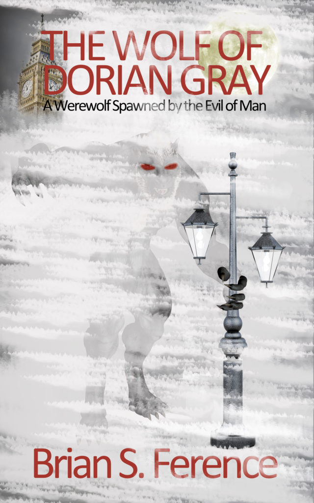
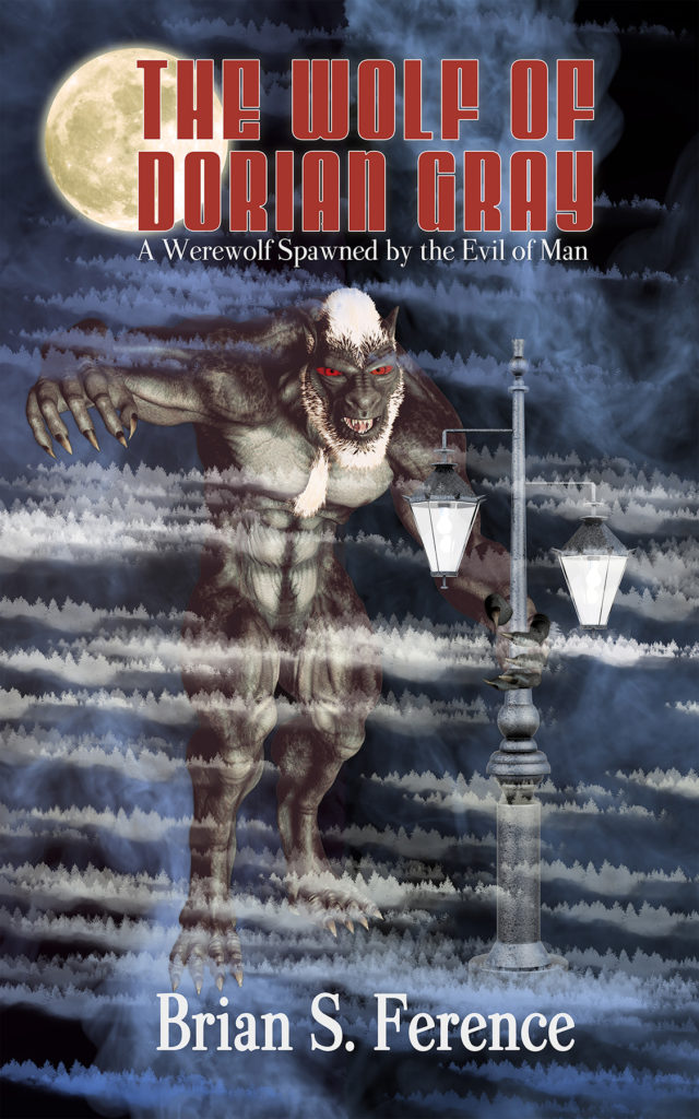
The first version of the book cover for The Wolf of Dorian Gray – A Werewolf Spawned by the Evil of Man was a labor of love. I used my Photoshop background and went through several iterations to create my vision on the printed book cover. I was very pleased with it and many have responded that they love it. However, experts have informed me that it might not sell as well as a different design. Below are a few iterations of my indie book cover redesign journey. Please vote in the poll and comment and leave your feedback on what I have settled on for the changed book cover design for my self-published book.
Original Book Cover Design |
Thumnail |
 |
 |
Version Two of Redesigned Book Cover |
|
| In the version below I tried to add some color and contrast to make the photo jump out particularly when viewed very small. Notice the difference in the thumbnails. | |
 |
 |
Version 3 of Indie Book Cover Redesign |
|
|
I was pleased with version 2 above but several people still said they preferred the white and I wanted to correct several “issues” such as the background being too busy and some other defects. I made another version with no Big Ben in the background although I hated removing it. |
|
 |
 |
Version 4 for my Self-Published Book Cover |
|
|
Version 3 was an improvement but didn’t quite have the same amount of contrast. It was received very well but the thumbnail was a little hard to make out. Also despite my love of the font’s I was informed by the experts that certain font’s are as likely to sell the book. So I made some changes in the final version below such as lightening the werewolf. Please comment below is this better or worse that the original or other versions? |
|
 |
 |
Version 5 By Popular Demand |
|
|
By popular demand, version 5 which is a combo of version 4 and the original but with new fog! |
|
 |
 |
Version 6 Updated Fonts |
|
| I wasn’t happy with some of the fonts so one more change. Less yellow, more color, and shadow on legs. | |
 |
 |
[yop_poll id=”1″]

